5 Lighting Tricks to Make Your Home Feel Instantly Cozier
Sep 18, 2026



Forget the latest paint trend. Designers say one timeless neutral shade is the secret to a living room that always looks polished and expensive from day to night.
Advertisement
When it comes to painting a living room, interior designers say the best option to elevate the room is a timeless neutral.
According to House Beautiful, designers agree that a soft, taupe, almost parchment-like shade is the one color that can outlast trends and make any living room look expensive.

A living room with a warm, neutral paint color | Source: Pexels
Johanna Lyle, founder of Jo Lyle & Co., recommends Farrow & Ball's Stirabout, an earthy oatmeal shade with subtle grey undertones. "I think a mid-tone neutral is always a safe bet in a living room," she said. "White can sometimes read as the default; a nuanced neutral like this gives the room a point of view without competing with everything else."
Advertisement
Designers Elizabeth Bennett and Mallory Robbins of Kobel + Co. agree, favoring shades that blend well with light at any time of the day. "We love timeless colors that transition beautifully from day to night," Bennett said. "Colors akin to warm parchment or plaster evoke this feeling effortlessly."
For Blair Moore, founder of Moore House Design, Sherwin-Williams' Wool Skein, a creamy khaki shade with olive undertones, is her go-to color. "It shifts with the natural light and creates a beautiful backdrop that allows the furniture, art, and architectural details to really come forward," Moore said.
Advertisement
The secret to making a living room, or any room for that matter, look expensive is the right paint color. Rich, earthy neutrals are a safe bet, according to Homes & Gardens, as well as deep olive green, delicate off-whites, soft mauve, and rich burgundy.
But more than the color, how you use them is just as important. Consider contrast, layering, and texture to achieve the overall mood you intend for your space.
Advertisement
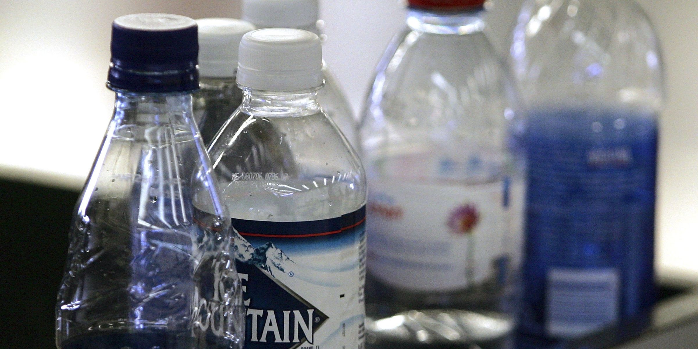
According to a new report, the TSA is considering reversing its 20-year-old policy by allowing PreCheck travelers to bring water bottles through security checkpoints without needing to empty them first.
Sep 14, 2026
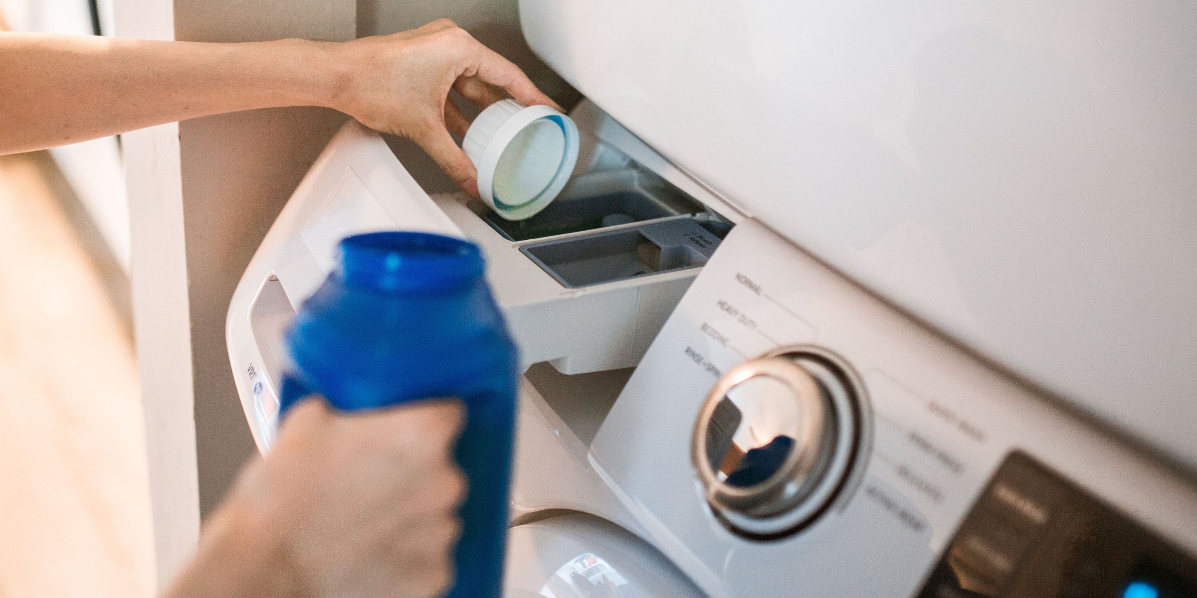
Adding an extra dose of detergent may seem like an easy solution to get cleaner clothes. But according to laundry experts, it usually does the opposite.
Sep 14, 2026
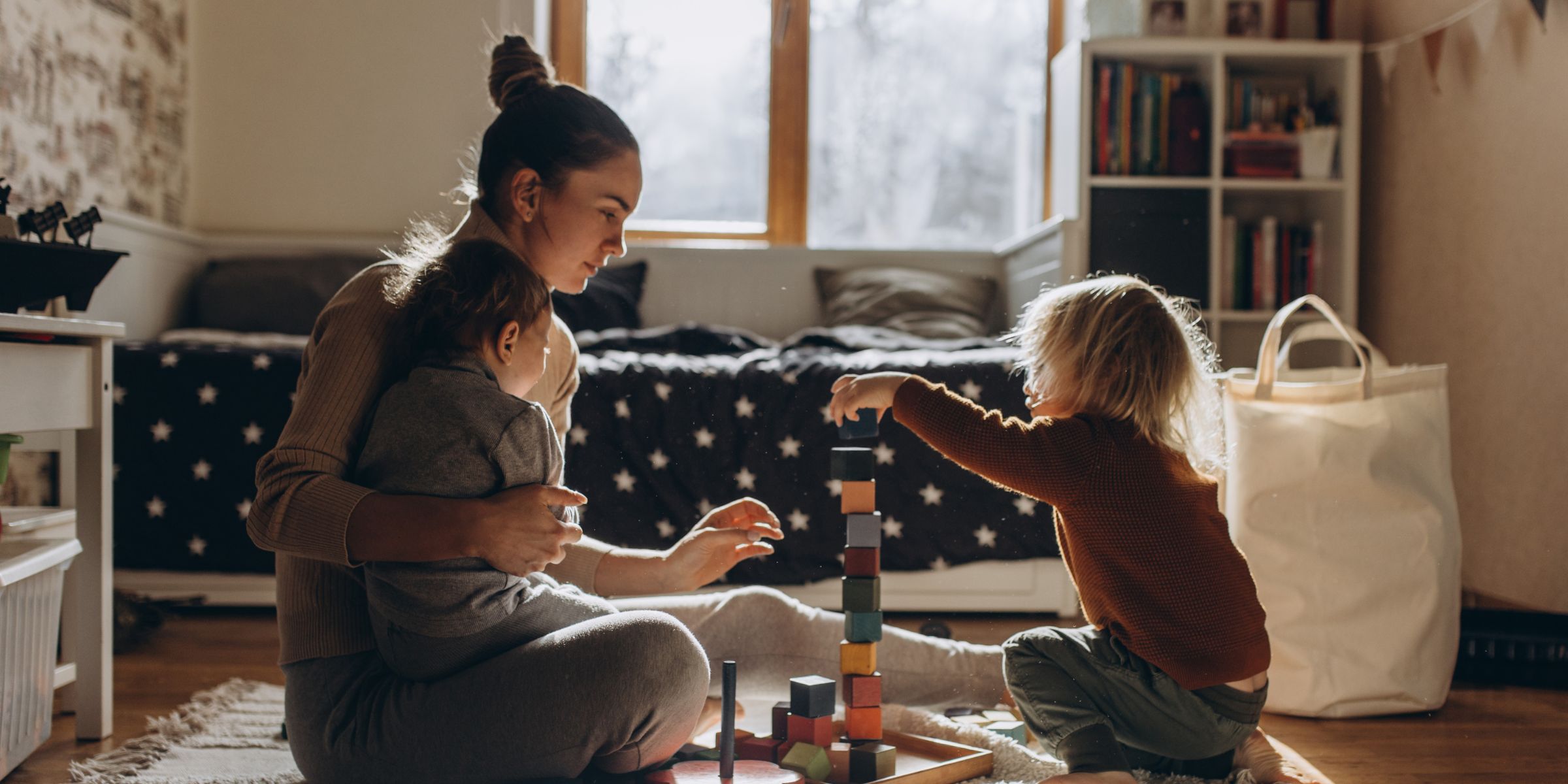
Gentle parenting was once hailed as the gold standard of modern child-rearing, but it's since drawn sharp criticism from experts. Here's how parents can strike a better balance between empathy and structure.
Sep 15, 2026
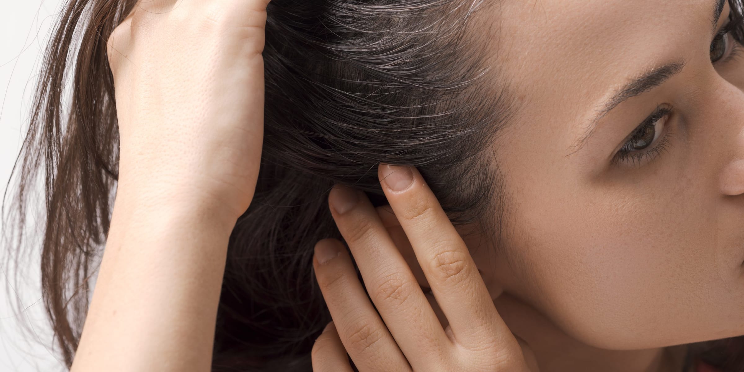
Scalp care is skincare's newest star, and dermatologists say it deserves just as much attention as your face routine. Here's how to keep the skin under your hair happy and healthy.
Sep 15, 2026

Lisa Rinna and Harry Hamlin attended The Hollywood Reporter x SAG-AFTRA Emmy Nominees Night at Chateau Marmont, where Lisa turned heads in a dramatic black couture gown. But the couple's latest photos captured a detail that quickly caught people’s attention.
Sep 15, 2026
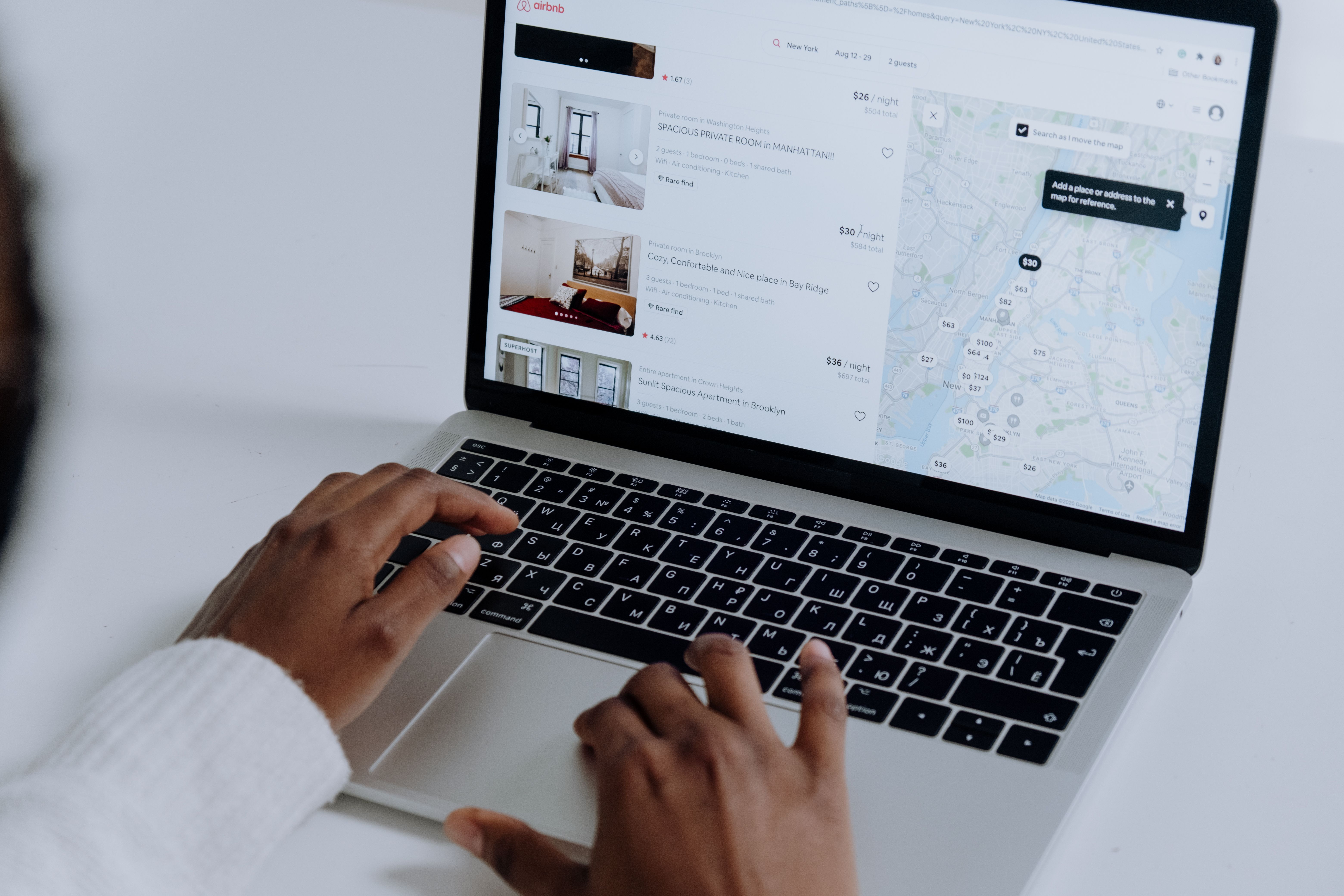
That glowing five-star hotel review might not have been written by a guest at all. As AI-generated reviews flood travel sites, more customers are getting fooled, but a few simple checks can help you tell real feedback from fake.
Sep 15, 2026

Gallery walls are back for 2026, but with a decidedly looser, more personal spirit than the matchy-matchy grids of the last decade. Here's what's driving the shift toward eclectic, "collected over time" displays.
Sep 16, 2026

More parents are ditching screens for old-school fun like board games and VHS tapes. Experts say the "going analog" trend is less about nostalgia and more about giving kids the limits they secretly crave.
Sep 16, 2026

Meghan Markle joined a school parents' chat with a friendly greeting, only for it to backfire completely. Here is how a simple text message triggered an unexpected security alert for the royal family.
Sep 16, 2026
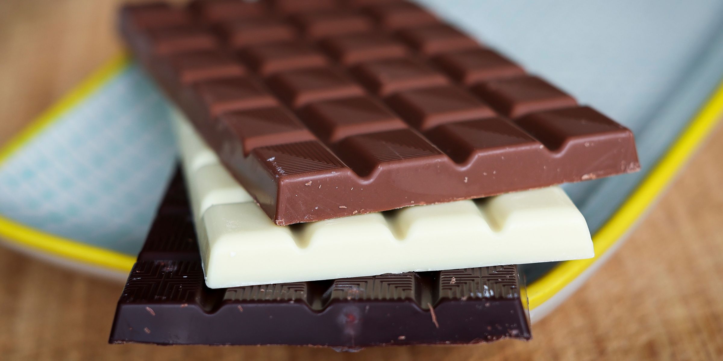
Doctors know a thing or two about health, but that doesn't mean they skip dessert. From dark chocolate to a scoop of ice cream, here's what six health experts actually reach for when craving something sweet.
Sep 16, 2026

Yellowstone crews recovered a record-breaking haul of trash from the park's hot springs this year, and some of it, like a McDonald's toy and a lump of children's slime, is stranger than you'd expect.
Sep 16, 2026

From baby Botox to diaper cream, Jennifer Lawrence's beauty routine is refreshingly unfiltered. In a candid interview with Vogue, she talks about what she's willing to try, and what she isn't.
Sep 17, 2026
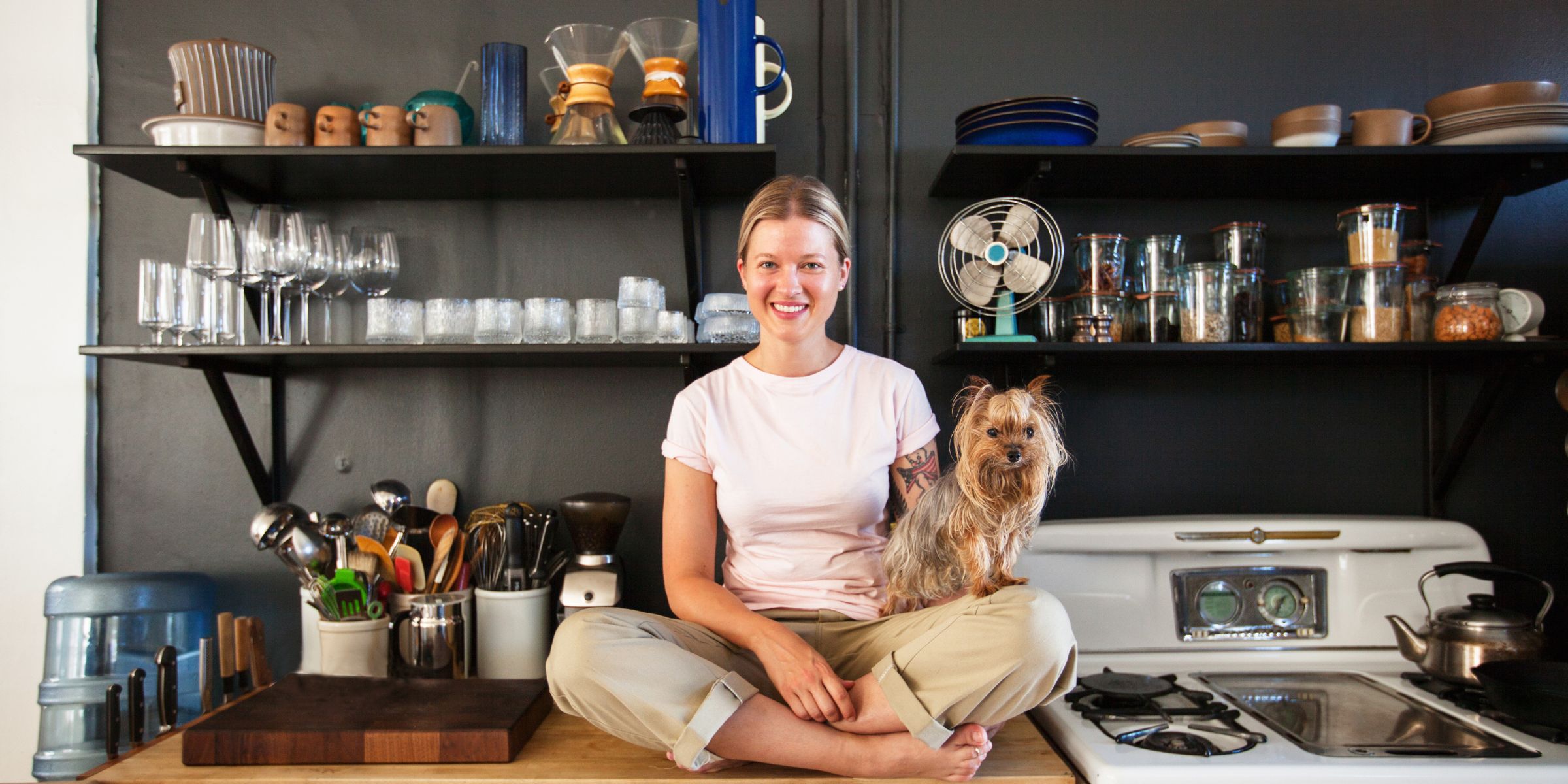
Kitchen clutter piling up fast? These seven clever storage hacks make the most of every inch, no matter how small your kitchen is. From open shelving to ceiling-hung racks, a few smart tweaks can completely transform your space.
Sep 17, 2026

Screens are more accessible to children than ever, and parents are struggling to strike the right balance. Experts share age-based guidelines and practical tips for building healthier digital habits at home.
Sep 17, 2026